Typography for Engineers & Font Types for Technical Documentation
By
Ethan Fahey
•
Typography may seem like a small detail, but it plays a major role in how teams communicate, especially in technical environments. When Slack overhauled its interface in 2019, much of the work focused on refining typography choices that quietly shape how quickly engineers absorb information, how clearly code is presented, and how polished internal and external documentation appears. For technical teams, typography isn’t about aesthetics; it’s about reliability, readability, and maintaining a consistent professional standard across every UI, spec sheet, and product demo.
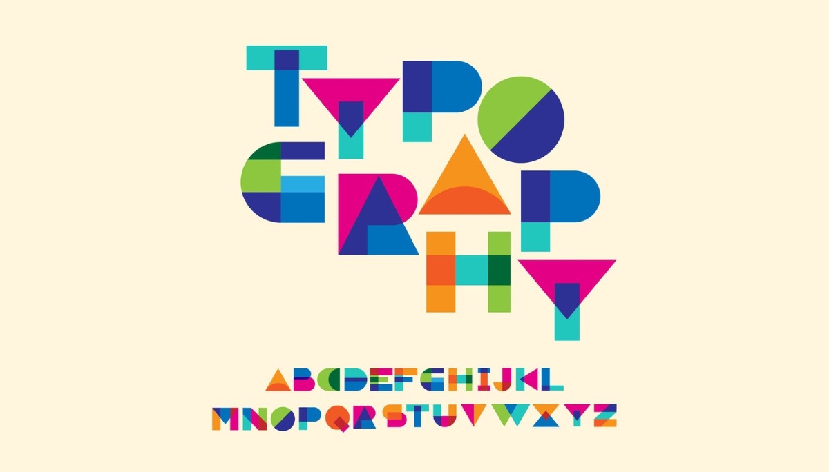
Engineers tend to approach typography with performance and clarity in mind, which is why understanding the five core type classifications, serif, sans-serif, monospace, display, and script, is essential. Each serves a distinct purpose, from documentation to code editors to user interfaces, and choosing the wrong type can unintentionally slow teams down. As companies scale, having a thoughtful typography system becomes part of good technical infrastructure.
Key Takeaways
The right font choices affect how quickly teams absorb information, read code, and navigate documentation, making it a technical infrastructure concern, not just a design preference.
Serif, sans-serif, monospace, display, and script each serve distinct purposes across code editors, documentation, and interfaces. Choosing the wrong type can unintentionally slow teams down.
A thoughtful typography system maintains reliability and polish across UIs, spec sheets, and product demos as companies scale.
For technical teams, typography decisions should prioritize clarity and readability over visual appeal.
Essential Typography Types for Technical Teams
The foundation of effective technical communication rests on understanding five primary typeface classifications, each engineered for specific purposes in professional environments. Serif typefaces, characterized by small decorative strokes called serifs extending from letterforms, excel in print-based technical documentation where traditional authority and formality matter. Sans serif typefaces, literally meaning “without serifs” from the French word “sans,” dominate digital interfaces and screen-based communication due to their clean, modern appearance and superior screen legibility.
Monospaced typefaces revolutionized technical documentation by ensuring each character occupies the same width, making them indispensable for computer code, data tables, and any context requiring precise character alignment. Display typefaces serve specialized roles in technical branding and presentation contexts, typically reserved for headlines and visual impact rather than body text readability. Script typefaces, mimicking calligraphic handwriting, find limited but important applications in formal technical agreements and signature contexts.
Engineers need different fonts than designers because technical communication prioritizes clarity, consistency, and functional performance over aesthetic experimentation. While designers might choose typography to evoke specific emotions or brand personalities, engineering teams require typefaces that reduce cognitive load, maintain legibility across various devices and platforms, and support long-term readability in documentation that may be referenced for years. This functional approach to typography selection directly impacts team productivity and professional credibility.
The evolution of typography in technical contexts reflects broader technological shifts. Early computers were limited to monospaced fonts due to character-based display limitations, establishing expectations that persist in modern development environments. As display technology advanced, sans-serif typefaces gained prominence in user interfaces, while serif fonts maintained their dominance in formal printed documentation. Understanding these historical patterns helps explain why certain font choices feel “appropriate” in specific technical contexts.
Modern engineering organizations increasingly recognize typography as a systems design decision rather than a cosmetic choice. Consistent typography standards across documentation, interfaces, and presentations signal organizational maturity and attention to detail: qualities that clients, investors, and potential hires evaluate when assessing technical competence. The typeface family you choose becomes part of your technical infrastructure, requiring the same thoughtful consideration as any other tool in your development stack.
Serif Typefaces for Technical Documentation
Serif fonts distinguish themselves through decorative strokes extending from the main letterforms, creating “feet” that guide the eye horizontally across lines of text. This structural characteristic makes serif typefaces particularly effective for long-form technical documentation where sustained reading comprehension matters more than quick scanning. The contrast between thick and thin strokes in quality serif designs creates rhythmic strokes that reduce eye fatigue during extended reading sessions, a crucial consideration for technical specifications, research papers, and comprehensive user guides.
Old-style typefaces represent the historical foundation of serif design, featuring minimal contrast between thick and thin strokes and diagonal stress in curved letterforms. Times New Roman, the most ubiquitous old-style serif, became the default choice for technical documentation precisely because its moderate proportions and traditional authority convey reliability without calling attention to the typography itself. Old-style serifs work particularly well for technical whitepapers and formal documentation where institutional credibility matters more than contemporary aesthetics.
Transitional serifs evolved to bridge classical Roman form with more modern design principles, featuring vertical axis orientation and increased contrast between stroke weights. Georgia, specifically designed for screen display, demonstrates how transitional typefaces can maintain serif readability in digital contexts while preserving the formal authority associated with traditional styles. These fonts excel in technical reports and academic papers where both print and digital distribution are expected.
Modern serifs push contrast to dramatic extremes, with razor-thin horizontal strokes and bold vertical elements that create high visual impact. However, their delicate thin strokes make them problematic for body text in technical documentation, particularly at smaller sizes or in low-resolution digital environments. Computer Modern, the default typeface for LaTeX mathematical typesetting, represents a specialized modern serif optimized specifically for scientific notation and academic publishing.
Slab serifs occupy a unique position between serif formality and monospace functionality, featuring thick, blocky serifs with minimal contrast between stroke weights. Rockwell exemplifies the slab serif approach, offering serif authority while maintaining the robust character shapes that perform well across various technical contexts. These typefaces bridge the gap between traditional serif documentation and the practical needs of technical teams working primarily in digital environments.
The choice between serif variations depends largely on your documentation’s primary distribution method and audience expectations. Print-heavy technical documentation benefits from traditional styles that leverage serif legibility advantages, while documents intended for both print and digital consumption perform better with transitional designs optimized for multiple media. Understanding these distinctions helps engineering teams select serif typefaces that enhance rather than hinder technical communication effectiveness.
Sans-Serif Fonts for User Interfaces and Digital Platforms
Sans-serif typefaces have dominated screen-based technical communication since the 1990s due to their superior digital rendering characteristics and clean, unadorned appearance that reduces visual complexity in user interfaces. The absence of decorative serifs eliminates thin strokes that can become pixelated or disappear entirely at small sizes on low-resolution displays, making sans serif fonts the practical choice for applications, dashboards, and any interface where immediate clarity takes precedence over traditional formality.
Neo-grotesque fonts represent the refined evolution of early sans serif design, eliminating the quirky characteristics of their predecessors in favor of neutral, versatile letterforms. Helvetica, the archetypal neo-grotesque, achieved ubiquity in technical interfaces precisely because its lack of personality allows content to dominate without typographic distraction. Arial, developed by Monotype as a Helvetica alternative for Microsoft systems, demonstrates how technical requirements can drive typography standardization across platforms. Roboto, Google’s neo-grotesque designed for Android interfaces, extends this tradition into mobile-first technical communication.
Geometric sans-serifs construct their letterforms from simple geometric shapes, creating the ultra-modern aesthetic associated with contemporary tech companies and startups. Futura, the most influential geometric sans serif, features perfect circular letter shapes and sharp angular vertices that convey precision and forward-thinking design philosophy. Proxima Nova modernizes the geometric approach with subtle humanist adjustments that improve readability while maintaining the clean, technological aesthetic that appeals to engineering-focused organizations.
Humanist sans-serif typefaces incorporate subtle variations in stroke width and letterform proportions that reference calligraphic handwriting traditions, resulting in improved readability compared to more mechanically constructed alternatives. Open Sans and Source Sans Pro exemplify how humanist characteristics can enhance legibility in web applications without sacrificing the clean appearance that technical teams prefer. These fonts perform particularly well in documentation platforms and knowledge bases where sustained reading is expected.
Grotesque and Neo-Grotesque Classification
Franklin Gothic and News Gothic represent the original grotesque category, featuring an industrial aesthetic and distinctive character quirks like spurred letter shapes and varied stroke weights. These early sans serifs emerged during the Industrial Revolution, reflecting the period’s emphasis on functionality over ornamentation. While their historical character limits their application in modern technical interfaces, they remain valuable for technical documentation requiring industrial or vintage associations.
The Swiss design movement of the 1950s and 1960s elevated Univers and Helvetica to international prominence, establishing the clean, systematic approach to typography that continues to influence technical communication design. This movement emphasized grid-based layouts and neutral typography that support rather than compete with informational content, principles that align perfectly with engineering documentation requirements.
Arial’s development in 1982 by Monotype represents a crucial moment in technical typography, creating a Helvetica alternative optimized for digital reproduction and Microsoft’s emerging software ecosystem. This licensing-driven innovation established the precedent for technology companies developing proprietary typefaces optimized for their specific technical requirements, a practice now common among major platforms like Google, Apple, and Adobe.
The impact on modern engineering team communication extends beyond mere font selection to broader questions of brand consistency and professional presentation. Teams using consistent neo-grotesque typography across documentation, presentations, and interfaces signal organizational sophistication and attention to detail that influences how clients, investors, and potential employees evaluate technical competence.
Accessibility considerations become crucial when selecting sans-serif typefaces for technical interfaces, particularly contrast ratios and font weight selection required for WCAG compliance. The Web Content Accessibility Guidelines specify minimum contrast ratios between text and background colors, while font weight selection affects readability for users with visual impairments or dyslexia. Understanding these requirements helps engineering teams choose sans-serif fonts that meet legal compliance standards while maintaining the clean aesthetic preferences of technical users.
Monospace Fonts for Code and Data Presentation
Monospaced typefaces solve the fundamental alignment problem in technical communication by ensuring each character occupies precisely the same width, enabling perfect vertical alignment of text elements regardless of letter combinations. This uniform spacing property makes monospace fonts essential for computer code, where proper indentation communicates logical structure and prevents syntax errors that could result from misaligned characters. Unlike variable-width fonts, where an ‘i’ takes minimal space and a ‘w’ requires maximum width, monospaced designs create predictable, grid-based text layouts crucial for technical accuracy.
Programming environments universally adopt monospace fonts because consistent character spacing enables developers to visually parse code structure, align comments with corresponding code blocks, and identify indentation errors that could cause runtime failures. Fira Code revolutionized programmer typography by introducing ligatures—special character combinations that display complex operators like ‘!=’ and ‘=>’ as single, more readable symbols while maintaining the underlying monospace character grid. Source Code Pro, designed by Adobe specifically for coding environments, optimizes character shapes for extended screen reading while preserving the technical precision developers require.
Terminal and command-line interfaces depend on monospace fonts to maintain the character-based display conventions inherited from early computing systems. Menlo on macOS, Consolas on Windows, and Inconsolata on Linux represent platform-optimized monospace designs that ensure consistent command-line experiences across operating systems. These fonts balance technical requirements with modern typographic refinements, improving readability without sacrificing the functional precision that system administrators and developers expect from command-line environments.

Data visualization contexts benefit enormously from monospace typography when presenting tabular information, financial reports, or any content requiring column alignment. Courier New, despite its typewriter associations, remains valuable for situations requiring mechanical precision and character-by-character alignment. Monaco, originally developed for early Macintosh systems, demonstrates how monospace fonts can maintain technical functionality while incorporating subtle design refinements that improve sustained readability.
Modern developments in monospace typography include variable-width approaches like Recursive, which allows designers to adjust character spacing and stylistic variations while maintaining the core alignment properties that make monospace fonts technically essential. JetBrains Mono, developed by the IDE company for their development tools, incorporates research on programmer eye fatigue and character recognition to optimize the coding experience for extended sessions.
Performance considerations become crucial when selecting monospace fonts for code editors and IDEs, as font rendering speed directly impacts developer productivity during real-time editing sessions. Well-optimized monospace fonts reduce the computational overhead required to render thousands of characters in large codebases, while poorly designed fonts can introduce lag that interrupts the programming flow. Understanding these performance implications helps technical teams choose monospace fonts that support rather than hinder development productivity.
The tabular figures feature in monospace fonts ensures consistent number alignment in financial applications and data dashboards, where decimal point alignment and column consistency convey precision and professionalism. This characteristic extends monospace utility beyond programming contexts into broader technical documentation requiring numerical accuracy and visual organization.
Display and Script Typography for Technical Branding
Display fonts serve specialized purposes in technical communication contexts, typically limited to headlines, presentation titles, and marketing materials where visual impact takes precedence over sustained readability. Unlike body text fonts designed for extended reading, display types emphasize distinctive character shapes and bold visual presence that capture attention and communicate brand personality. Technical organizations often employ display fonts in conference presentations, product launch materials, and executive summaries where a memorable visual impression matters more than functional text processing.
Script typefaces mimic calligraphic handwriting or actual handwriting, creating personal, authoritative impressions suitable for formal technical agreements, digital signatures, and ceremonial documents. While script fonts rarely appear in operational technical documentation, they serve important roles in contracts, partnership agreements, and formal communications where traditional authority and personal touch enhance legal or business credibility. The calligraphic influence in quality script designs conveys expertise and attention to detail that can strengthen technical organizations’ professional image.
Decorative typefaces represent the experimental edge of display typography, featuring extreme stylistic characteristics designed for maximum visual impact rather than functional communication. Startups and technology companies occasionally employ decorative fonts in branding contexts to signal innovation and creative thinking, but these applications require careful consideration of audience expectations and professional credibility. The risk of appearing unprofessional often outweighs the potential benefits of distinctive typography in technical contexts.
Case studies from major technology companies illustrate strategic display typography applications that enhance rather than undermine technical credibility. GitHub’s use of understated display fonts in its marketing materials maintains developer credibility while creating a memorable visual identity. Atlassian employs playful display typography in conference presentations and team communications that reflects their collaborative software focus without compromising professional authority. Stripe’s sophisticated typographic system demonstrates how financial technology companies can use refined display fonts to convey both innovation and trustworthiness.
The key to successful display typography in technical contexts lies in understanding when visual impact enhances communication versus when it creates distraction or undermines credibility. Technical conferences, startup pitch presentations, and product marketing represent appropriate contexts for carefully selected display fonts, while operational documentation, code comments, and formal specifications require more conservative typographic choices that prioritize function over form.
Script and display typefaces require particular attention to audience expectations and cultural context, as typography choices that seem innovative to internal teams may appear unprofessional to clients, investors, or potential employees from more traditional backgrounds. Balancing creative expression with professional credibility represents one of the most challenging aspects of typography selection for technical organizations seeking to differentiate themselves while maintaining industry respect.
Typography Selection Framework for Engineering Teams

Developing a systematic approach to typography selection helps engineering teams make consistent, informed decisions that support both immediate communication needs and long-term organizational goals. Performance metrics should drive font selection decisions, particularly font loading times and their impact on application speed and user experience. Web fonts, while offering design flexibility, introduce network latency that can affect Core Web Vitals scores and overall site performance. System fonts, despite limited design options, eliminate loading delays and provide guaranteed cross-platform availability.
Cross-platform consistency represents a fundamental challenge in modern technical communication, as teams must balance design ambitions with practical limitations across Windows, macOS, iOS, Android, and various web browsers. Web fonts provide design control at the cost of loading time and potential display failures, while system fonts ensure consistent rendering but limit creative control. The rise of variable fonts offers a compromise solution, allowing multiple font weights and styles in a single file that reduces bandwidth while maintaining design flexibility.
Licensing considerations often receive insufficient attention from technical teams, yet font licensing can create significant legal and financial risks for organizations. The SIL Open Font License provides royalty-free usage for most technical applications, covering popular choices like Source Sans Pro, Open Sans, and Liberation fonts. Commercial typefaces from Adobe, Monotype, and other foundries require licensing fees that can become substantial for large organizations or products with extensive distribution.
Integration with design systems requires careful coordination between typography choices and broader user interface components, color schemes, and layout patterns. Successful design systems establish clear hierarchical relationships between different font weights, sizes, and styles that maintain consistency across products while providing enough flexibility for diverse content types. Typography standards should specify not just font selection but also line spacing, paragraph spacing, and responsive behavior across device sizes.
Quality assurance processes should include typography testing as part of regular development workflows, ensuring font rendering consistency across browsers and devices. Automated testing tools can catch typography regressions that might otherwise go unnoticed until production deployment. These tests should verify font loading performance, cross-browser rendering consistency, and accessibility compliance, including contrast ratios and scalability requirements.
The decision matrix for typography selection should weigh technical requirements against aesthetic preferences, considering factors like target audience expectations, brand consistency requirements, performance constraints, and licensing costs. Engineering teams benefit from establishing clear criteria for evaluating new font choices, preventing ad-hoc decisions that could undermine long-term consistency and professional presentation.
Technical Implementation and Best Practices
Font loading strategies directly impact user experience and site performance, making technical implementation as crucial as font selection itself. The CSS font-display property controls how browsers handle font loading delays, with options ranging from immediate fallback display to extended loading timeouts. The ‘swap’ value provides optimal balance for most technical applications, displaying fallback fonts immediately while replacing them with web fonts once loaded. Performance-conscious teams increasingly adopt ‘fallback’ or ‘optional’ values that prioritize loading speed over perfect typography consistency.
Variable fonts represent the cutting-edge evolution of font technology, incorporating multiple weights, widths, and stylistic variations within a single font file. The OpenType 1.8 standard enables this consolidation, reducing the number of font files required for comprehensive typography systems while maintaining design flexibility. Variable fonts particularly benefit responsive web applications where font weight and size need to adapt seamlessly across device sizes without requiring additional file downloads.
Responsive typography extends beyond simple font size scaling to encompass sophisticated fluid type scales that adapt letter spacing, line height, and font weight based on viewport dimensions and reading context. The CSS clamp() function enables sophisticated responsive typography that maintains optimal readability across device sizes while reducing the complexity of media query management. These techniques ensure typography performs well on everything from mobile interfaces to large desktop displays.
Developer tools integration streamlines typography workflow for engineering teams working across multiple platforms and environments. VS Code font configurations allow developers to customize their coding environment with preferred monospace fonts, ligature support, and font rendering optimizations that improve long-term comfort and productivity. Terminal customization enables consistent monospace experiences across command-line interfaces, shell scripts, and system administration tasks.
Self-hosting font files provides performance and security advantages for enterprise applications where external dependencies create risk or compliance concerns. Google Fonts API integration offers convenience for rapid prototyping and development, but production applications often benefit from downloading and serving font files from the same domain as other application assets. This approach eliminates external network dependencies while providing complete control over font loading behavior and caching strategies.
Font optimization techniques include subsetting font files to include only required characters, reducing file sizes for applications serving specific languages or character sets. Compression algorithms like WOFF2 significantly reduce font file sizes without affecting display quality, while preloading critical font files can eliminate the delay between page load and font rendering.
Typography Tools and Resources for Technical Teams
Google Fonts democratized professional typography by providing free access to hundreds of high-quality typefaces with simple API integration for web applications. The service offers both convenient cloud-based loading and downloadable font files for self-hosting, making it valuable for both prototyping and production deployment. However, enterprise security considerations may require self-hosting rather than relying on Google’s CDN, particularly for applications handling sensitive data or operating in regulated industries.
Adobe Fonts, included with Creative Cloud subscriptions, provides access to thousands of commercial typefaces with licensing that covers both print and digital applications. This service particularly benefits teams working across multiple media types, from print documentation to web applications to video presentations. The integration with Adobe’s design tools streamlines workflow for teams using Photoshop, Illustrator, or InDesign alongside development tools.
Open source alternatives like Font Squirrel, DaFont, and GitHub font repositories offer cost-effective solutions for technical teams operating under tight budget constraints. Font Squirrel’s web font generator provides comprehensive format conversion and optimization tools that help teams prepare fonts for production deployment. GitHub hosts numerous high-quality open source typefaces designed specifically for technical applications, including programming fonts with ligature support and Unicode coverage optimized for developer workflows.
Typography auditing tools help technical teams maintain consistency and quality across large-scale applications and documentation systems. Contrast checkers verify WCAG accessibility compliance, ensuring typography choices meet legal requirements for users with visual impairments. Readability analyzers evaluate text density, line length, and font size relationships to optimize comprehension. Performance monitors track font loading times and rendering speed across different devices and network conditions.
Font management systems become essential for larger engineering organizations working with multiple typefaces across various projects and platforms. These tools help teams organize font libraries, track licensing compliance, and maintain consistency across distributed development teams. Cloud-based font management enables teams to share typography resources while maintaining version control and access management.
Professional typography education resources help engineering teams develop a sophisticated understanding of typography principles beyond basic font selection. Understanding concepts like x-height, cap height, and baseline alignment enables more informed decisions about font pairing and hierarchy. Knowledge of typographic history and evolution provides context for understanding why certain fonts feel appropriate in specific technical contexts.
Conclusion
Choosing typography for engineering teams isn’t just about aesthetics; it’s a practical decision that affects performance, accessibility, legal compliance, and long-term maintainability. Serif, sans serif, monospace, display, and script fonts each play different roles in technical work, from the precision required in code editors to the clarity needed in business-facing documentation. Getting typography right means balancing design goals with real-world constraints like load speed, platform consistency, and licensing costs. It’s why many engineering orgs now treat typography as part of their technical infrastructure, not an afterthought.
As documentation and UI clarity become increasingly critical to business success, organizations benefit from establishing typography standards that support professionalism, readability, and long-term scalability, especially with emerging trends like variable fonts, responsive systems, and AI-assisted font selection on the horizon. This is also where Fonzi AI fits into the picture: by connecting AI engineers with companies building real-world AI products, Fonzi helps teams stay ahead of these shifts and bring stronger technical communication practices into their workflow. Whether you’re standardizing code environments or refining customer-facing docs, thoughtful typography directly influences how your work is understood, trusted, and adopted.
FAQ
What types of typography work best for technical documentation?
What font categories should engineers use for code and documentation?
What’s the difference between typeface and font (explained for engineers)?
What are the best classic fonts for engineering presentations and reports?
How does typography choice affect readability in technical and UI design?


