How to Draw Technical Diagrams
By
Ethan Fahey
•

Modern software systems built around microservices, distributed infrastructure, and event-driven architectures have become complex enough that teams can no longer rely on tribal knowledge or scattered documentation alone. As systems scale, architecture diagrams become essential tools for understanding dependencies, debugging issues, communicating design decisions, and coordinating across engineering, platform, and product teams. In practice, these diagrams function as living maps of infrastructure, services, and data flow that help organizations operate and evolve systems more effectively.
This article walks through the process of creating technical architecture diagrams step by step, from rough early sketches to polished documentation that teams can actually maintain over time. The focus is practical rather than theoretical, with guidance that engineers can apply immediately to real systems and workflows. For companies hiring infrastructure, backend, or AI engineers, strong architecture documentation is also increasingly viewed as a signal of engineering maturity. Platforms like Fonzi reflect this trend by helping teams identify candidates who can not only write code but also communicate complex systems clearly and operate effectively in large-scale engineering environments.
Key Takeaways
Technical diagrams turn complex systems into precise visuals that development teams and stakeholders can understand at a glance, reducing miscommunication errors that plague cloud migrations and system redesigns.
Effective architecture diagrams start with a clear purpose, then layer in software components, data flow, and relationships step by step to avoid overwhelming viewers.
Different diagram types, such as system overviews, data flow diagrams, sequence diagrams, and deployment diagrams serve different questions about a system and should not be mixed randomly.
Choosing the right diagramming tools and standards, then validating diagrams with the team, prevents confusion and outdated technical documentation.
The right level of detail depends on the audience, with engineers needing API-level specifics while leadership benefits from high-level overviews that group components into domains.
Technical Diagrams, Architecture Diagrams, And When To Use Each
A technical diagram is any visual representation of a technical system, process, or structure that serves as an unambiguous blueprint communicating functionality, construction, or interactions with precision. These diagrams illustrate everything from API flowcharts mapping REST and gRPC endpoints to cloud infrastructure visuals of VPCs and Kubernetes clusters, and CI/CD pipeline graphs tracing deployments. A technical architecture diagram, also known as an architectural diagram, depicts the structure and design of a software system or application, illustrating the system’s architecture, components, and data flow.
Technical architecture diagrams are essential for communicating the system’s design and functionality to stakeholders, helping them understand the system’s structure and how different components integrate and interact. Software architecture focuses specifically on system components, their boundaries, and communication pathways in complex systems. Software architecture patterns such as layered architecture, microservices architecture, and event-driven architecture provide standard templates for designing software systems and offer proven solutions to recurring design challenges. These architectural patterns are reusable design solutions that address common design concerns, promoting consistency, modularity, and scalability in software development projects.
Common types of technical diagrams include UML diagrams, network diagrams, flowcharts, and schematic diagrams. The most frequently used architectural diagrams since around 2015 include high-level system diagrams showing the entire platform, application architecture diagrams drilling into specific services, data flow diagrams tracing information movement, integration diagrams mapping connections to third-party providers, and deployment diagrams showing how software maps to infrastructure. Client-server architecture remains a distributed application structure that separates tasks and workloads between servers and clients, commonly used in distributed computing scenarios.
Use cases for these diagrams span onboarding new developers who need to understand a system’s structure quickly, communicating with leadership about risk and capabilities, documenting compliance controls for audits, planning a migration from monolith to microservices architecture, or designing event-driven architecture for real-time processing. Technical diagrams serve as historical records for completed systems or products, and they matter beyond software as well, appearing in network topology documentation for IT operations, sensor layouts in IoT deployments, and infrastructure planning across industries.
Core Types Of Technical Diagrams Used By Development Teams
No single type of diagram can answer every question about a system, so teams rely on a small toolkit of diagram types selected by purpose. A 2025 State of DevOps report found that teams using three to five complementary types see 2.5x faster deployments compared to those relying on a single view.
High-level software architecture diagrams provide platform-wide panoramas depicting major services, data stores, third-party systems like payment processors or authentication providers, and coarse data flow patterns. These diagrams help everyone from product managers to CTOs gain a clear picture of how the system works at a strategic level. High-level technical architecture diagrams simplify complex system structures, facilitating better decision-making and planning by providing a clear overview of system components and their relationships.
System and application architecture diagrams zoom into a specific bounded context, microservice, or application to reveal its internal structure. These show interfaces, modules, queues, caching layers, and existing services within that domain. For teams practicing Domain-Driven Design, these diagrams map directly to bounded contexts and aggregates.
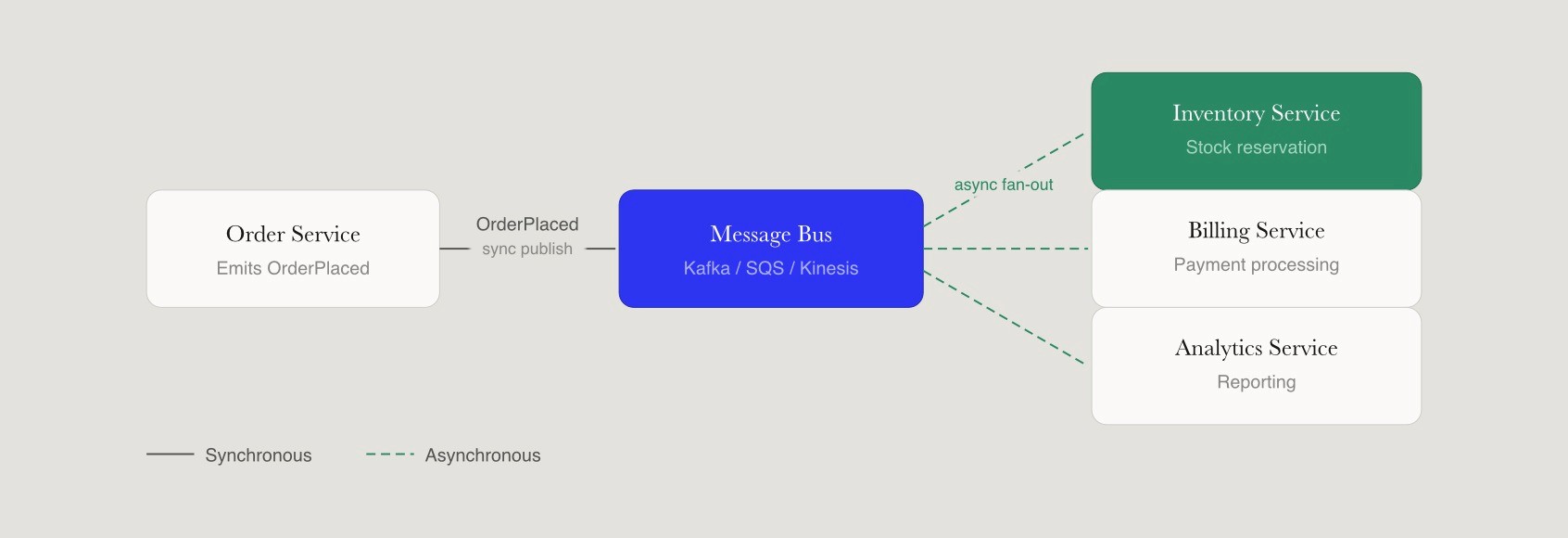
Data flow diagrams and event-driven views focus on how data moves between services, topics, and databases. For streaming and reactive systems built on Kafka, Kinesis, or similar platforms, these visuals show how events like OrderPlaced or UserRegistered fan out to various consumers, including inventory, billing, analytics, and notification services. Business Process Model and Notation is a method for process modeling that provides a standardized way to visualize business processes, making it easier to communicate and analyze process flows.
Sequence diagrams illustrate processes from the perspective of services, detailing interactions and the order of operations among different components. These trace temporal interactions, such as how a checkout request touches authentication, inventory, pricing, and payment services in sequence, expose latency bottlenecks and potential bottlenecks in the request flow. Flowcharts serve a related purpose, representing the execution of logic and providing a comprehensive view of a process at every step, highlighting decision points and actions.
Deployment and infrastructure diagrams map services to cloud environments, regions, and nodes in AWS, Azure, or Google Cloud. These show load balancers, autoscaling groups, managed databases, and deployment environments clearly. Use case diagrams are typically used to show basic requirements through user interactions with a system, clarifying user needs and roles.
A practical example from a fintech firm in late 2025 paired a high-level architecture diagram of their core banking platform with deployment diagrams for a microservices architecture rollout planned through 2026, cutting deployment risks by 35 percent through pre-validated infrastructure as code.
Step-by-Step: How To Draw A Technical Architecture Diagram
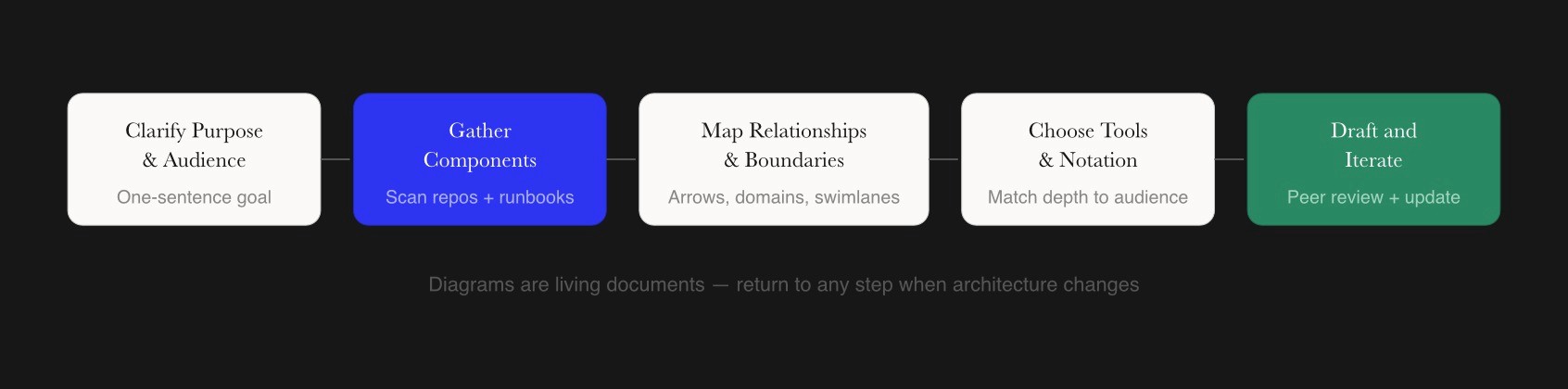
This section provides the core how-to guidance for creating architecture diagrams from scratch, whether mapping a legacy monolith or a greenfield event-driven platform. Creating practical technical architecture diagrams involves a combination of precise planning, understanding the audience, choosing the right tools, collaborative development, and avoiding common pitfalls. Creating an effective technical diagram requires a structured approach that prioritizes clarity and a clear understanding of the target audience.
Clarify The Purpose And Audience Before You Create Diagrams
Every technical diagram must answer a small set of questions to provide value. Before you create diagrams, define what specific problem you are solving, such as how a new login flow works in a zero-trust setup or how an event-driven ingestion pipeline moves telemetry from IoT devices to an ML inference pipeline. Without this focus, visuals devolve into noise that confuses rather than clarifies.
Identify the intended audience because this determines depth and notation. Backend engineers need port and protocol details like HTTP/2 on port 443 versus gRPC on port 1936. SREs want failover paths and SLA information. Data engineers trace schema evolution in streams. Product managers seek capability maps showing what the system does. Business analysts need to understand how different systems connect to business outcomes. CTOs demand risk highlights showing single points of failure and the technology involved.
Concrete purposes might include planning a 2027 migration from a single-region PostgreSQL database to a multi-region sharded setup, documenting a new microservices-based billing platform, or mapping how user interactions flow through an e-commerce checkout. The outcome of this step is a written one-sentence goal, such as: Show how orders move through our microservices architecture from the web client to the data warehouse.
Gather System Information And Identify Components
Gathering real system information prevents fictional diagrams that mislead teams. Scan GitHub repositories for service mesh configurations, review existing runbooks and incident postmortems, examine Kubernetes manifests or Crossplane compositions for infrastructure as code definitions, and consult PagerDuty playbooks that reveal unmonitored queues or overlooked dependencies.
List all relevant main components for the diagram exhaustively. This includes clients like React SPAs and mobile SDKs, APIs using GraphQL federation or REST, backend services, message queues like SQS or RabbitMQ, databases like PostgreSQL or DynamoDB, caches like Redis clusters, third-party providers like Auth0 or Stripe, and batch jobs orchestrated by Airflow. Internal Atlassian audits found that 40 percent of initial sketches miss critical components like message brokers, so thoroughness matters.
For example, enumerating components in a 3-tier web application might reveal a React frontend on port 3000, a Node.js API layer on port 443 using HTTP/2, a Redis cluster cache on port 6379, and PostgreSQL database replicas on port 5432. At this stage, the focus is on breadth, ensuring no critical component, such as a content management systems integration or authentication provider, is missed before shaping the diagram structure.
Map Relationships, Data Flow, And Boundaries
This step connects the components with arrows and lines indicating calls, events, and data movement. Choose consistent directional arrows for synchronous requests versus asynchronous events, using solid lines for sync RPCs and dashed lines for async messages. Annotate arrows with protocols or message types where it helps clarity, such as JSON payloads averaging 10KB or protobuf messages.
Labels in diagrams should be short and concise, and every arrow should be labeled to explain the interaction between components. Drawing a data flow for an event-driven architecture might show OrderPlaced events moving from an order service through a message bus to inventory for stock reservation, billing for payment processing, and analytics for reporting. This shows how components interact clearly and helps identify potential bottlenecks in the flow.
Define context boundaries or domains using shaded containers or swimlane diagrams so readers see where one microservice or subsystem ends, and the next begins. This boundary clarity matters for understanding the application’s architecture and prevents cross-contamination views where unrelated details obscure insights. Using consistent shapes and colors in diagrams can assign specific meanings, aiding in shared understanding of the visual representation.
Choose Diagramming Tools, Notations, And Layout
Common diagramming tools that engineers use in 2026 include AI-native canvas tools like Eraser that auto-suggest C4 layouts from text descriptions, docs-as-code tools like Mermaid.js that render diagrams directly in Markdown and pull requests, and IDE plugins like VS Code Excalidraw extensions. Some teams use curated talent platforms like Fonzi to bring in architects familiar with C4 model, unified modeling language conventions, and infrastructure as code patterns for complex projects.
Pick a notation level appropriate to your audience. Simple labeled boxes and arrows work for leadership decks offering insights at a strategic level, while more formal UML or C4 element types suit deeply technical documentation. Using familiar symbols allows viewers to interpret diagrams quickly without referring to a legend.
Use a clear layout with users at the top or left, core services in the middle, databases at the bottom, and external systems at the edges. This arrangement enables data flow to be read consistently left-to-right or top-to-bottom, giving viewers a better understanding of how the system works. Entity-Relationship diagrams are widely used for data modeling, particularly in designing relational databases, and can be categorized into three levels of abstraction: conceptual, logical, and physical.
Draft The Diagram, Add Details, And Iterate With The Team
Create the first draft by placing the most important application components first, then layering in secondary services, queues, and integrations. Start from the central service that handles the primary workflow and expand outward. Add details like ports, protocols, SLAs, retry strategies, or security boundaries as needed, recognizing that not every diagram requires the same level of precision.
Feedback from colleagues can help identify ambiguities in drafts. Conduct a short peer review loop with development teams, SREs, and security engineers to catch missing services or incorrect data flow. A concrete example is discovering an unmodeled batch export to an analytics warehouse during review that changes how you visually represent the architecture.
Technical diagrams enhance communication among stakeholders by providing a visual representation of complex systems, making it easier for both technical and non-technical team members to understand the architecture and user interactions within a system. Diagrams are considered living documents that must evolve with the project to remain accurate and useful, so update them when architecture changes, such as adding a new event-driven consumer or spinning up a new region in late 2026 or 2027.
Best Practices For Creating Technical Diagrams That Stay Clear Over Time
Drawing a diagram once is easy, but keeping it understandable and accurate as systems evolve is the real challenge. A Spotify case study showed that consistent visuals halved onboarding time for new engineers. Technical diagrams prioritize accuracy and clarity over aesthetics, acting as a universal language for engineers and project stakeholders.
Visual consistency practices include fixed spacing, alignment grids, and a limited color palette of around five colors for different component types. Simple geometric shapes reproduce clearly at different zoom levels, ensuring readability whether viewing a diagram on a laptop or projecting in a meeting room. Diagrams should avoid clutter by using whitespace generously, and can be broken into smaller views if they have more than 20 to 30 elements.
Use legends, labels, and simple icons so that color is never the only way to distinguish components. This improves accessibility for readers with color blindness and ensures diagrams remain interpretable when printed in grayscale. Standardization in technical diagrams uses international symbols so professionals globally can interpret them without language barriers.
Modularize diagrams by scope, creating a separate architecture diagram per domain or bounded context instead of one overloaded image for the entire organization. This prevents the diagram soup problem, where unrelated details from different systems obscure insights about any specific area.
Integrate diagram updates into change management or pull request processes so new microservices, message topics, or edge services are added as part of routine software development lifecycle work. Store diagrams alongside code in repositories or documentation sites so they become part of the same review and version history as the system itself.
Using technical diagrams can significantly improve documentation quality, as they combine visual elements with textual explanations, allowing for clearer and more comprehensive information sharing.
Comparing Major Technical Diagram Types And When To Use Them
This section provides a quick reference for choosing the right diagram for each problem instead of reusing the same style everywhere. Multiple complementary architectural diagrams, not a single master drawing, give the best understanding of complex systems.
Technical Diagram Types, Typical Audiences, And Strengths
Diagram Type | Primary Audience | Best For | Example Use Case |
High-Level Architecture | Leadership, New Hires | System overview, boundaries, high level structure | 2026 SaaS platform showing auth, core, and analytics domains |
Data Flow / Event Driven | Data Engineers, Architects | Propagation, async flows, communication pathways | Telemetry from IoT devices to Kinesis and Snowflake pipeline |
Sequence Diagram | Backend Devs, SREs | Temporal interactions, latency analysis | Checkout flow touching auth, inventory, and payment services |
Deployment / Infrastructure | SREs, Ops Teams | Runtime mapping, scaling, risk management | EKS clusters with ALB and autoscaling in multi-region AWS |
Component / Application | Architects, Senior Devs | Internal structure of bounded contexts | Microservice modules, queues, and caches in billing application |
Network Diagram | Infrastructure Teams | Physical and logical connectivity | VPC peering, firewall rules, and load balancer configurations |
Cross-functional workshops favor high-level diagrams that provide a clear understanding of capabilities and boundaries. In-depth engineering design reviews benefit from sequence diagrams and data flow views that show exactly how different application components communicate. When designing a new event-driven feature, pair a data flow diagram with a sequence diagram to show both the overall propagation and specific service interactions. For explaining architecture to a non-technical client, use a simplified high-level diagram that groups integration solutions and cloud services into understandable domains.
Collaborative Workflows And Tools For Creating Technical Diagrams
Technical diagrams become most powerful when they serve as shared artifacts that development teams can update, comment on, and reference during design discussions and incident reviews. Real-time collaboration through cloud-based tools like Miro or Whimsical allows teams to generate diagrams together, with version history and integrations with work management platforms like Jira or Notion, keeping diagrams close to day-to-day tasks.
Some teams prefer code-centric tools like Mermaid, PlantUML, or Graphviz to generate diagrams directly from text descriptions. These diagram definitions can live in repositories alongside application code and be updated via pull requests, ensuring diagrams evolve through the same review process as the DevOps system itself. This approach particularly suits teams that value documentation as code.
Marketplaces such as Fonzi can connect startups with experienced architects who know how to combine diagramming tools, software architecture patterns, and collaborative practices for complex system design projects. Practical workflows include capturing design discussions in a shared workspace during meetings, exporting final software architecture diagrams to PDFs for compliance audits, and embedding technical diagrams into internal wikis for long-term knowledge sharing and various aspects of system documentation.
Conclusion
Technical diagrams are more than visual aids: they are structured ways for engineering teams to reason about architecture, dependencies, operational risk, and future change across complex systems. The most useful diagrams start with a clear purpose, use the right level of abstraction for the audience, and evolve collaboratively as systems grow. When treated as living documentation instead of static artifacts, they become tools that actively support design reviews, onboarding, troubleshooting, and cross-team alignment.
A practical next step is to review one existing architecture diagram this week, refine it using the principles outlined in this article, and circulate it for feedback across your engineering team. Even small improvements in clarity can significantly improve communication and decision-making around system design. For recruiters and hiring managers, engineers who can explain and document complex systems clearly are increasingly valuable, especially in distributed AI and infrastructure environments. Platforms like Fonzi help surface this type of high-signal talent by emphasizing practical engineering communication and real-world system experience alongside technical depth.
FAQ
What is a technical diagram and what types do engineering teams use most?
How do I draw a technical architecture diagram step by step?
What are the best tools for technical diagramming?
What makes a technical diagram effective versus confusing?
How detailed should a technical diagram be for engineers, leadership, or clients?


